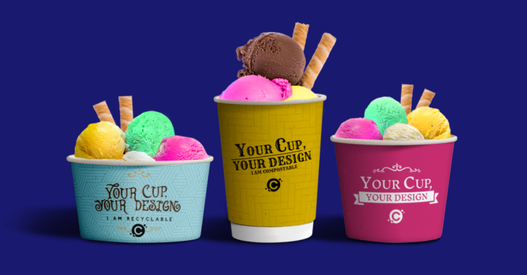
Custom Printed Paper Coffee Cup Design Tips
Even though we offer a design service – and an online cup design tool – many customers like to have their own graphic designers produce the layout for their custom printed paper cups. Some even like to design their own themselves
I interviewed my colleague Adam Kiszka who works on the design team here at CupPrint and asked him for his tips.
Here’s my top tips for you or your designers to prepare artwork for your printed cup project:
Software for Cup Designs
- Illustrator is the way to go. The best software to prepare cup design with is, without doubt, Adobe Illustrator (AI).
- It gives the biggest flexibility for adjusting the design to cup template.
- You can also work with InDesign and Photoshop, but AI is our recommendation.
Paper Cup Printing Color Model
- Work in the CMYK workspace. Avoid RGB or spot colors when not needed.
- Our main printing process used for printing cups is high resolution full color process CMYK.
- This process is great for accurate representation of photos and graphics.
- If you have specific Pantone references for your brand, no problem. We convert all Pantone references to the CMYK version of this reference using up-to-date Pantone Color Bridges Books.
- For the most part this is very accurate. But there are some colors to watch out for.
- The colors with the most discrepancies to be aware of are bright oranges – such as PMS 021.
- Please be aware that some spot colors cannot include our usual food safe inks.
- Pastel and Neon color palettes are a couple more examples. Always please enquire first.
Vector vs. Raster Graphics for Cup Designs
- Rasterised logos are a common issue we encounter. (JPG, PNG and GIF are raster – these are harder to resize without compromising quality in final print.)
- I recommend vector all the way as it gives more flexibility in color corrections. Plus print quality is generally better. Vector files – Adobe Illustrator (AI), EPS and the right types of PDF can be more easily manipulated, resized and colour corrected while maintaining higher resolution for a better quality appearance in print. If a designer created your brand and logo, you should ask for vector master files so you can produce a wide range of versions for a range of use for signage, advertising and of course branded paper cups!
Black Needs to be Black
- Black mixes using all 4 Process Colors are not recommended as they might print as dark brown due to high ink coverage.
- To print black we advise using K100% only, additionally to achieve deep black Cyan boost between 40-60% can be used.
READ ABOUT CUP PRINTING FINISHES
Small Text Sizes and Tiny Elements
- Text 6pt and below might not be legible.
- Please take care with small imprints and symbols like: © ® and ™.
- If it’s not readable when you print it on your printer, it won’t be on the cup.
- Line thicknesses below 0.5pt might differ from screen appearance, especially on matt finish cups with dark backgrounds and bright graphic elements.
- This is due to uncoated paper which ‘soaks’ in some of the ink.
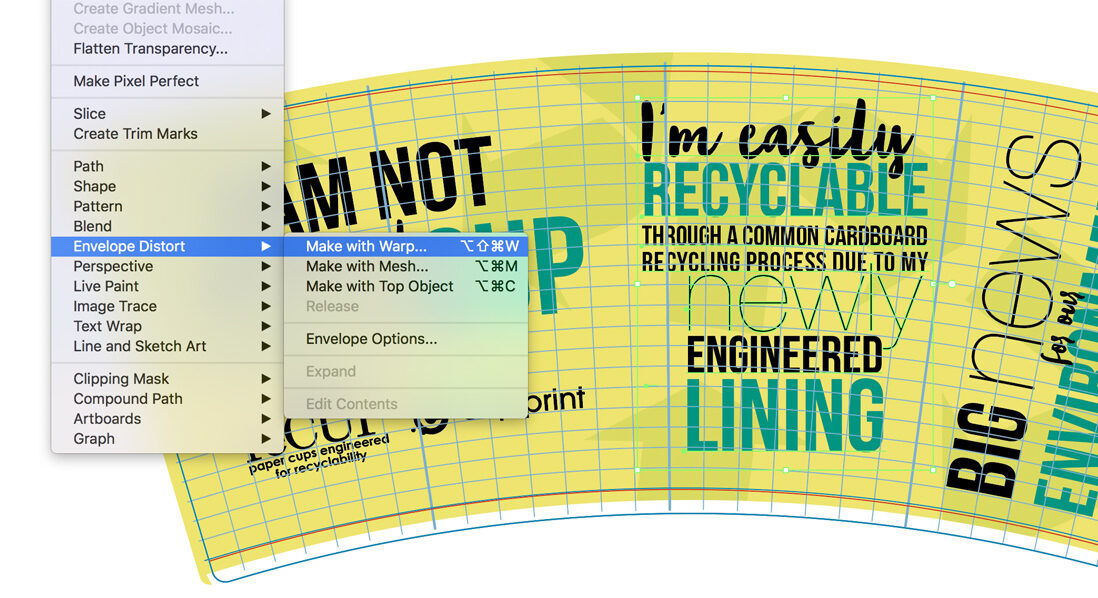
Follow the Grid
- Use our gridlines to adjust elements using warping effect in Illustrator to make elements appear straight on the cup.
- Ideally elements need to be arched so envelope distortion matches horizontal and vertical lines of the grid.
- Finally, the text must feature the same curvature as the provided grid pattern to ensure that the printing results appear optically correct and linear.
- This approach is also used when positioning images.
- In this case, we also recommend creating a new image layer and adjusting the edges of the image to fit the pattern.
- There are some exceptions like vertical text or circular elements, where warping might affect general proportions of the elements.